Chicago Public Schools
Front-End Developer, Web Designer
September 2010 thru March 2018
At Chicago Public Schools I was a Front-End Developer and Web Designer. I helped the web service team maintain and update the public website as well as various applications used by Principals, Teachers, and Parents everyday. We made applications so that parents can easily see school districts and find information about schools. Some of the major projects I was a part of was the redesign of CPS and Annual budget website.
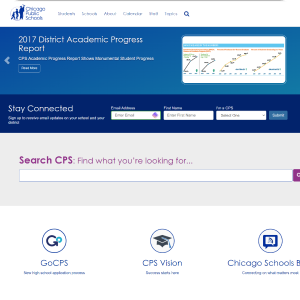
CPS Redesign
 Left is before website redesign. Right is the redesign
Problem
Users primary source to get information about CPS was from their local schools, when all the information was readily available on the website. It was difficult to navigate and hard to find information that parents and teachers wanted to know. Parents and teachers just weren't coming to our website for information or using the resources that were available to them.
Research
We first started to research possible solutions. We first went to Google Analytics to see where our users were coming from, what devices the were using, and what were some of the pages that were most popular. We cross referenced with some of the big events of the year, like start of school and open enrollment. The data from google would tell us a lot but we also wanted to get a first account of what parents and teachers wanted. So we took a survey targeted to the parents and teachers in the district.
Our research and analysis told us some very enlightening things such as:
- most users were viewing the website from a mobile device even though the site was not mobile friendly
- parents day to day would get information from their particular schools but specific seasonal events they wold go to CPS to see, such as open enrollment, lunch menus, start of school, and any special initiatives like GoCPS
- users had a hard time finding what they wanted and would default to a small search bar on the top
Solution
We wanted to reach as many people as we could. The major decision we made was to be mobile first. At the time we were using SharePoint CMS and evaluated if we wanted to move away from SharePoint but a complete overhaul of not only a new front end design but also a backend replacement would’ve taken a lot more effort and time. After looking at all our options we decided to overhaul our CSS and add in Bootstrap to accomplish what we wanted while still remaining on SharePoint. The downside to this was that we had to manually format each page, starting with our most popular pages first.
The decision to go mobile also allowed us to totally reevaluate the design and navigation, so we could make it a lot easier for parents, students, and teachers to find the information they need. This ultimately involved two key components, navigation and search. We realized from analytics that a lot users used our search function to find things. So, we took a google approach and made it front and center. It would be easy just to do that but if we wanted to truely help the users we also needed to make it better by adding fuzzy search and most used keywords. The other part was removing the old resource section in the middle and using a more dynamic three section in the middle that would change depending on any events or special initatives currently going on.
These two features paired with a cleaner more streamlined design to make sure that our content was easy to read and easy to find for our users. Always having the users in mind in all the decisions we made. So coming up with a simple clean design that made the content stand out was the best decision for us at the time. This also aligned very well with my design philosophy of content and message first then come up with a design that drives it.
Chicago Public SchoolsSkills used:
- HTML
- CSS
- Javascript
- .Net
- Sharepoint
- Photoshop